Illustration Toolbox: Creating Custom Illustrations for Your Contribution
Introducing the AR Patterns Design System

As you familiarise yourself with the descriptions, examples and ECA diagrams of AR Patterns, you may have noticed that we have consistently used stylized line drawings to illustrate the essence of an AR situation. In the spirit of open source, these artworks are based on an open design system where you can use backgrounds and cut-out objects (just like stickers!) to create your own illustration explaining your AR Pattern. Combine the pre-designed elements to describe new and innovative AR examples and collaborate on the requirements and implementation of the patterns in new applications and use cases. This guide will walk you through how to use these elements to bring your AR concepts to life.
Choose your Method
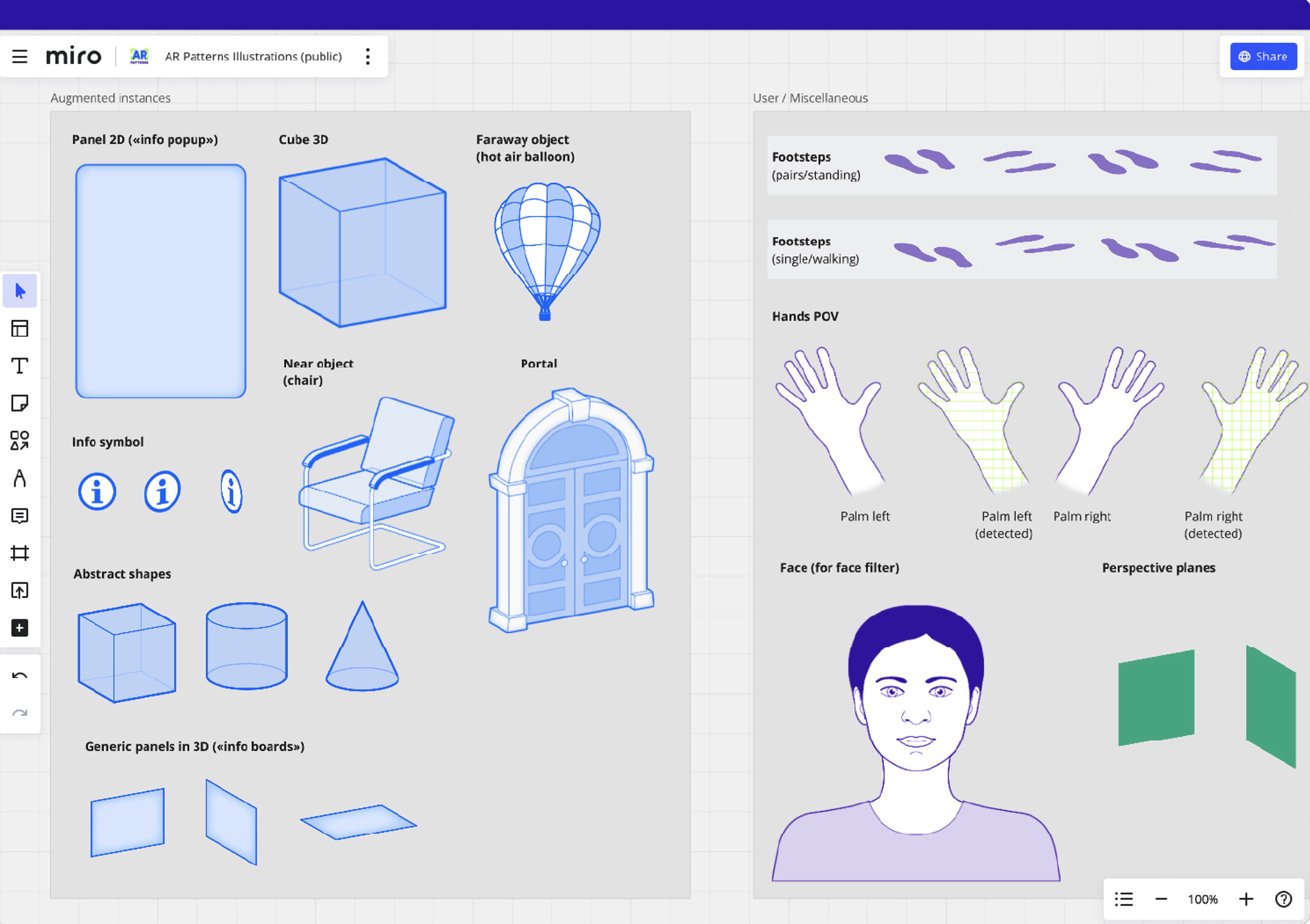
The easiest way to create an AR illustration is to access our Miro board . Alongside the set of existing examples, you'll find all the necessary backgrounds (a room, a street, or the outdoors) and objects (such as furniture, plants, or abstract shapes) available as real, detected, and augmented instances. Next, and most importantly, there's the user, represented as a simple pair of footsteps. This design choice enables the creation of illustrations that are independent of the hardware implementation (e.g. headset or handheld device) and allows us to focus on the core idea of the AR pattern. Of course, there are exceptions, such as hand pop-up menus or face filters, for which you'll find the appropriate assets. The final category is more technical in nature: the orange AR anchors provide a straightforward explanation of the augmentation's origin, positioning and orientation in space.

If you prefer to work in a vector drawing program (such as Sketch or Adobe Illustrator) rather than on the Miro board, you'll find the same assets as SVG files in the download link below. This gives you more options as you can modify the existing drawings or create new components following the style guide.
Building your own Scenarios
This step-by-step guide will help you create a clear and compelling illustration for your AR Pattern contribution.
1. Access the Miro Board or download the assets
To start building your own scenarios, access the Miro Board. Start with a blank 16:9 canvas, marked with the orange 'Start here' sticker.
2. Choose a backdrop
Depending on your AR scenario, you will need a backdrop. Let us have a look at the options available:
- The room (indoors): Probably the most common situation. Use it to position objects on the floor, in the air and on the walls, as you would in an everyday AR situation. The scale here is medium-small, for objects about 0.5 to 2m in size. If you need a smaller scale, you can add the table asset (see 3. Choose your props) and enlarge both elements to create a zoom-in situation on a tabletop.
- The park (outdoor): A bit more specific, this backdrop focuses on the sky or accommodates much larger AR objects (about 2 to 10 m in size). The depth scale is also more pronounced. The path in the park can also be used to place waypoints or similar -- be creative!
- The street corner: This situation is similar to the room, but more suited to using geolocation. The scale is slightly larger than indoors. Playful implementations can include temporal or staged elements, as you have a corner to hide behind the house.
- A blank canvas: Of course, you can also use a white background to showcase your AR implementation. However, be aware that you will lose some spatial orientation. The blank canvas can be used, for example, to show a face mask or AR objects in a POV that are not anchored to the environment.
3. Select your props
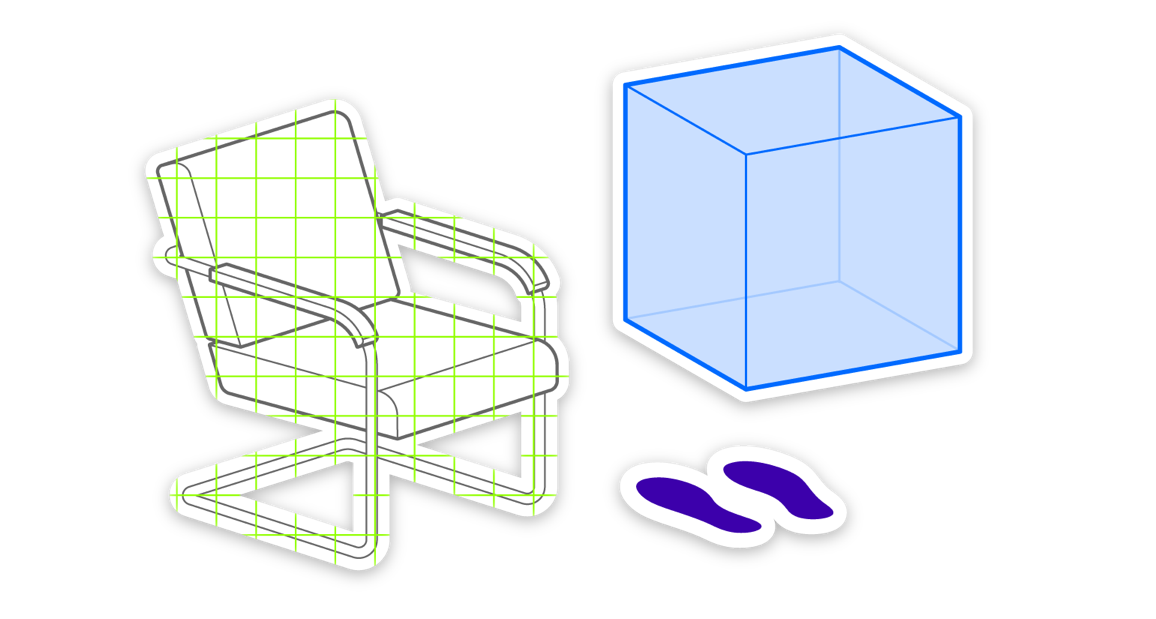
It may seem whimsical at first, but the props (chair, table, plant and picture) are important semantic cues in an AR experience! Play around with them and see how they can help you describe space, depth and orientation. As you may have noticed, the design uses parallel projection rather than classical perspective. This allows for a great deal of flexibility: You can position objects anywhere on the background and they will always fit the geometry correctly. Don't forget that you can also scale the objects. This can create a dramatic sense of depth in an outdoor environment.
4. Describe the detected instance
Every AR implementation needs a detection in order to be positioned in space. In the simplest case, this will be the floor, which will be detected by your AR software and used to position an object. See what detection templates the design system has to offer. The detected instance introduces our first color: bright green. Anything on the detected plane should be rendered in this color. In addition to color coding, the appearance of the drawing is also important:
- 2D Hatch: The area has been segmented from the 2D video stream of the AR hardware.
- 2D Edge: The object was detected as such in 2D, e.g. a chair.
- 3D Corners: The object was detected as a trigger, such as a QR code marker or a specific pre-programmed artwork.
- 3D Point Cloud: The object has been ‘3D scanned’, i.e. the volume has been extracted from the point cloud and detected as an instance.
- Combine with Border: Combine the hatching or point cloud with a border to indicate that the object has been detected and recognized.
5. Design your Augmentation
The blue layer represents any augmented instance. In the most basic implementation, this is a medium-sized cube. However, the augmentation can also be 2D, such as an info popup that appears either as an interface on a handheld screen or in front of the FOV in a head-mounted device. You will find a selection of basic objects in the design system. In addition to abstract shapes, you will find more specific objects such as the chair, a fantasy portal, and a hot air balloon. These can be used to convey more meaning, i.e. an everyday object, a pass-through object, and a distant object respectively. However, try to be as abstract as possible (and as specific as necessary) to make your AR Pattern example universally applicable.
6. Include the User
Showing where the user is standing (or sitting) is critical to understanding an AR pattern. In most cases, it is sufficient to position the two purple footsteps facing the augmentation. However, the footsteps are available in all three main directions and separately to simulate walking or other real-life movements. As it feels to dark in some implementations, the footsteps are rendered with 50 % transparency. For augmentations involving the user's body, we have prepared a set of POV hands (palms and index fingers) and a face (e.g. for face filters).
7. Specify the Marker
While developing the AR Patterns design system, we tried to keep things as simple as possible. However, if an illustration should describe everything as clearly as possible, we soon felt that something was missing: Information about where the augmentation is anchored and oriented. A simple marker (that introduces the orange layer), helps us with this.
- Origin (circle):Describes the origin of the augmentation, i.e. where the augmentation appears and to which object it is attached to.
- Anchor (diamond): In most cases, the augmentation will be positioned in the same place as it originated. Therefore, you will find the diamond inside the circle, i.e. the anchor inside the origin.
- Separate anchor: If the augmented object moves with time, or should be offset from the origin (e.g., when displaying a tag that should not cover the tagged object), the anchor (diamond) can be outside the origin (circle).
- Connectors: The dotted lines are used to connect separate origins and anchors for clarity.
- Orientation (arrow): 3D objects often have front and back sides. The orientation (usually to the user) is relevant. The orientation marker (arrow) can be used to indicate in which direction the front of the AR object is facing.
- 2D Corners: If the origin and anchor are at the (2D) interface level of your handheld device or in front of the FOV of the head-mounted display, the orange corners can be used to describe an anchor that is independent of the detected 3D world.
8. Enhance and export
If you need to add anything to enhance your illustration, please go ahead! Keep in mind, however, not to add any clutter and not to alter the illustration style:
- Real-world objects are white (#FFFFFF) with dark gray (#666666) lines (some gray shading can be used sparingly, only if necessary)
- Stick to the parallel projection!
- Detected instances are bright green (#90FF00), lines only, no fills or shading.
- Augmented instances are blue (#006AFF), using shading and some transparency.
- Markers are orange (#FF6E00) and should not be altered.
- Do not add text unless it is critical to understanding the meaning of the augmentation. If so, it should be part of the real or augmented world and not used as an explanation or annotation.
From Miro, export your 16:9 canvas as a PNG image:
- Click on the canvas
- Open the context menu with the three dots (•••)
- Select ‘Export as image’
In your preferred graphic design software, use the export function to generate a PNG image with a white background and a size of 1920×1080 pixels.
